
Introduction
I had a fun discussion with Bjorn Ferry, Biathlon23 and SportInDepth on Twitter. We debated if taking the 4th and 5th shot after shooting clean on the first three, is (mentally) harder than when you already have a miss in your first three shots.
After presumably reading my article Is one shot like any other in biathlon Bjorn sent the following chart and messages:
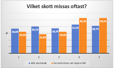
My thesis is that the last shot is difficult only if you did not miss earlier in the competition. If you only look at those who hit the first 9 shots on a sprint, I think the last shot has bad statistics. But not for those who missed already in prone.
I went through the individual and the sprint competitions in Pokljuka back in 2018 to find out if it is the case that the last shot is more difficult. I compared all shooting series (6410 shots) with those that arrived to the last standing with the chance to shoot clean.->
Shot 1,2,3,4,5; which is most often missed? For the entire starting field it was no clear tendency to miss shots four or five more often. For the group that arrives to the last stand with the chance to shoot clean, it becomes clear that shots four and five are harder. ->
It is also logical because then you have the chance to make a really good result. The pressure is increasing. *whole field = blue bars those with the chance to shoot full = orange bars
It would be fun to see if this is true if you look at an entire season. If you hit the first 8 targets in a sprint, or the first 18 targets in the other disciplines. What does it look like then? I think the fourth and fifth shots are harder.
Caveat
Before I continue, I want to be very clear. One, I am not a statistician, and two, Bjorn probably knows a little more about biathlon than I do, based on his 7 wins and 22 top-3’s in the IBU World Cup, World Champs and Olympics, not even counting his 7 medals in relays. So to go out and say I did not agree with his findings was, well scary.
Data
My data however told me a slightly different story. We also started with different datasets. His data was from the individual and sprint competitions (not sure if it includes men and women) in Pokljuka in 2018 only looking at the final standing shooting, for 6410 shots. Mine was from the 2017-18 season onwards to the Oberhof event in 2021-22. It includes the final standing shooting of the Sprint, Pursuit, Mass Start and Individual events. I also only included the top 30 athletes. And 6,410 shots -vs- 31,419 will make a difference. Not better or worse, but less influenced by outliers, and more predictable.
I did not have the data in a format where I could replicate the chart from Bjorn, so initially I took a different approach in my analysis.
Analysis, approach one
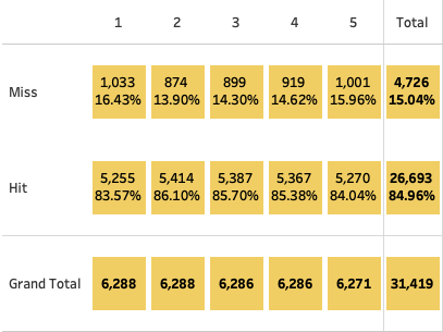
The chart shows the number of hits and misses per shot of the last shooting of an event (so 2nd shooting for Sprint, and 4th shooting for the other events). As shown in the previous article, the first and last shots have the lowest hit rates.
This data can be copied from Tableau to Google sheets where I can create a table that shows the probability for every shot combination.
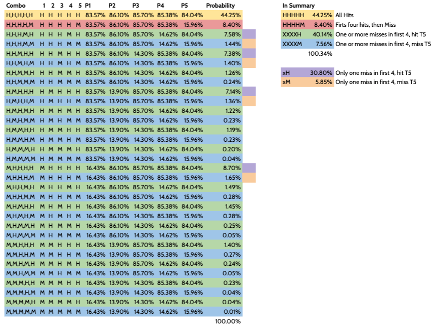
Now that we have a list of probabilities for every shot combination, we can group these combinations into:
| Combi | Probability |
| 44.3% | |
| 8.4% | |
| 40.1% | |
| 7.6% |
So hitting the fifth target after hitting the first four targets has a higher probability than when missing one or more targets in the first four shots. This conclusion is different from the conclusion Bjorn drew from his chart, but perhaps this is simply because I didn’t replicate the chart he used.
Analysis, approach two
To compare apples to apples I want to duplicate the chart from Bjorn. First, I used a different subset. Still from the same seasons, I included all athletes rather than the top 30 only. I also limited the data to only Mass Starts and Pursuits to limit the number of records (Goole Sheets crashed with more than one million cells). Also, these race disciplines probably have even more pressure, since it (wo)man to (wo)man rather than time-based. This left me with 107 races and 358 athletes for 98,400 shots.
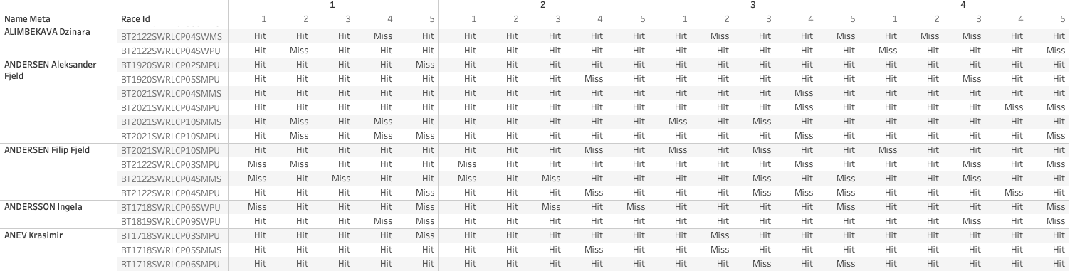
I moved this data over to Google Sheets where I could use the Pivot functionality to create the following table with Athlete, Race and shot full (20 shot) combination, in which the M indicates a miss and H a hit:
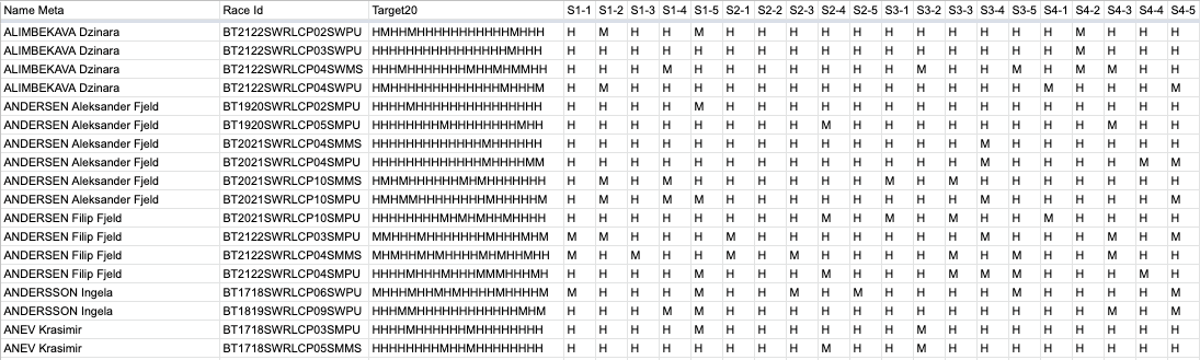
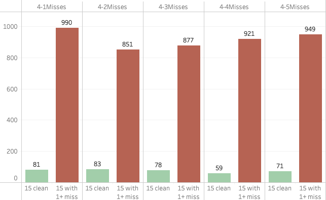
Going back to Tableau, I could now calculate the misses for every shot of the fourth (and last) shooting session, and create two groups of athletes: one that started the fourth shooting with 15 hits, and one that had at least one miss in the first 15 shots.
Going back and forth
Unfortunately, the way the data is formatted I could not convert this data to a percentage, so back to Google sheets I went to create a conversion table, which I then could use to create the chart similar to Bjorn’s.
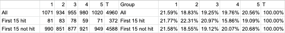
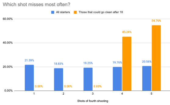
When I display the percentages for the group of all athletes as well as those that came into the fourth shooting with zero misses, again the conclusion that can be drawn is different from Bjorn.
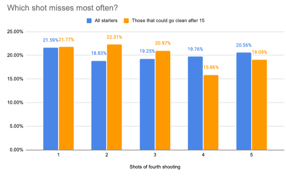
Let’s quickly put them side by side again to compare:
It is clear why Bjorn felt his data and chart are supporting his thesis that shooting targets 19 and 20 is harder when you go clean in the first 15 shots, compared to when you have a miss already. And I do agree with him that if you think about it would make sense. But no matter how I look at my data, I cannot come to the same result. The fourth shot is actually missed the least and the fifth is missed less often than shots one, two or three. Of course, for the fifth shot, this includes both those who shot clean the first 15 and then missed one or more shots in the final shooting.
First 18 shots clean
So what if we look at those shootings where the first 18 were clean? I basically did the same exercise adding up the misses per group in Tableau. Obviously the first three shots have no misses since the first 18 are clean. That doesn’t leave us with much data, with only 84 misses in total on the fourth and fifth shots.
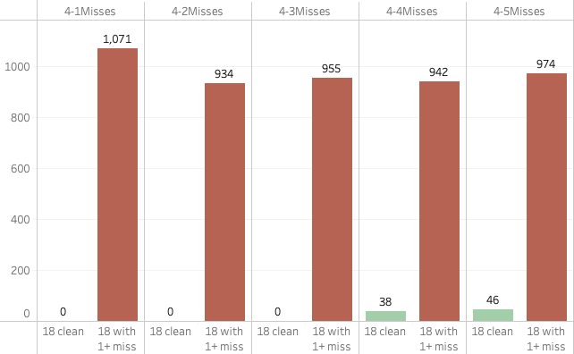
Again we bring this over to Google sheets and calculate the percentages.
From there we create a chart, from which I conclude that if anything the fifth shot is harder than the fourth, confirming our earlier finds that the first and last shots of a shooting are the hardest. But to draw any conclusions based on 84 shots only is not something would recommend.
Conclusion
From the chart I created, I cannot conclude that the 4th and 5th shots are harder when clean, compared to when one already has a miss. If anything, it seems there are fewer misses in shots four and five of the last shooting when one is clean.
One of the reasons I mentioned on Twitter is that if you make it to the fourth shooting without any misses, you are a pretty darn good shot. The odds of making the next five shots are pretty good. On the other hand, if you already had one or more misses in the first fifteen, perhaps you still have some work to do on the shooting, and having another miss is not an unrealistic expectation. We need to remember that this includes all athletes from Pursuits and Mass Starts, so up to 60 per race. That includes shooters who can use some improvement still, as well as the Laegreids and Eders of biathlon who shoot around 90%.
How else can we explain the differences? The last thing I want is to create the impression that I think I know better than Bjorn Ferry, and that his chart is wrong. This is not the case (to be clear)! Just the fact that my resulting chart does not support the thesis Bjorn stated makes me nervous, especially as he mentioned his chart confirms what he expected. Someone with his experience of course knows what he is talking about. But my data and analysis don’t live up to these expectations…
I mentioned I’m not a statistician, and although I double and triple checked my data and process, so I’m confident there are no mistakes in the data or process. But if anyone can tell me after reading this article that I went wrong I’d be happy to hear from you!
Another reason I believe there are different results is that both analyses are based on using different data sources and sample sizes. I should also mention that I don’t know the details of the process that Bjorn used to create his chart. Perhaps I misunderstood what he did and used, which may have led to doing a different analysis. The larger sample size I used typically leads to less obvious differences and fewer extremes And Bjorn used data from one event with a couple of races, which will make it subjective to conditions specific to Pokljuka. Something levelled out by using more data from different event locations with different weather conditions.
All in all, it was great fun and interesting to do this analysis, and I thank Bjorn Ferry for reaching out and sharing his chart and work. Although my work does not support his thesis, I hope this article hasn’t lost me a follower on Twitter… ;o)
Let me know what you think about this article by sending me a Tweet or DM! Any feedback is highly appreciated.