
To highlight what a great site Real biathlon is, and how easily the data can be used to give some great insights, below is a step-by-step on how to make a quick interactive chart based on the data referenced in the previous article. I used Google Sheets and Tableau Public, but you can use any of these kinds of tools that you are comfortable with, and publish a lookup chart within an hour. That’s how easy the real biathlon site is to collect biathlon data!
Step 1 – download & store the data
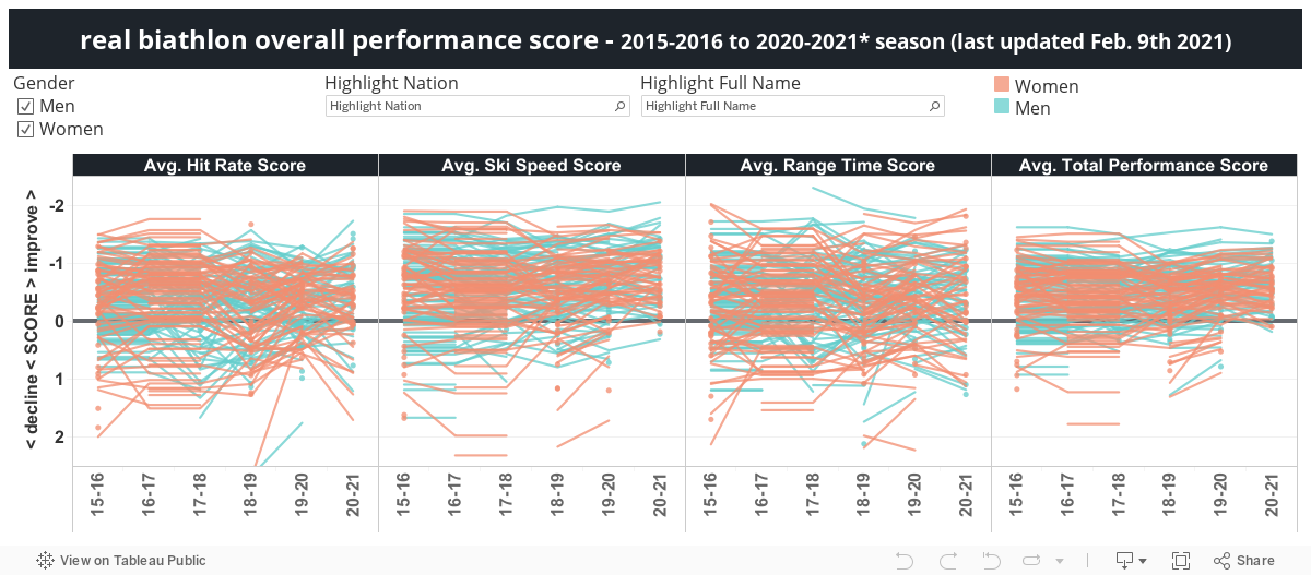
For the created chart I used the data of the last five season, for both men and women, limiting the data to only those athletes with at least 10 races. Since that never resulted in more than 100 athletes per gender and season, I did not set a filter on that.
After selecting the Season Statistics, Performance Score (for example, the 2019-2020 season for women), you can just select the table, copy, open a blank Google Sheet, select cell A1 and paste. In my case, my first row showed twice so I just removed one of them. Do this 10 times (five per gender), name the sheets appropriately (W1920, W1819, M1920, M1819, etc.) and export from Google Sheets to an xlsx file. You can export to text, but you would have to do that per sheet, where exporting to Excel (xlsx) exports all sheets at once.
Step 2 – open data in Tableau
In Tableau Public connect to the spreadsheet by:
- clicking on the Data menu > New Data Source
- click on Microsoft Excel in the Connect window
- select the xlsx file you just exported from Google Sheets
- at the bottom of the list that shows your sheet names, double click New Union
- drag all 10 sheets into the Union window
- click OK
Step 3 – create some calculated fields
- Full Name = [Given Name] + ” ” + [Family Name]
- Gender =
IF LEFT([Table Name],1) = "M" THEN "Men"
ELSEIF LEFT([Table Name],1) = "W" THEN "Women"
ELSE "Unknown"
END- Season = MID([Table Name],2,5)
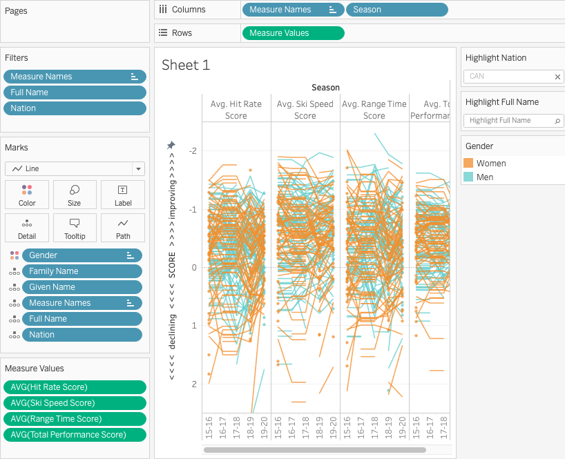
Step 4 – create the chart
Depending on what you want to show in your chart, the following differs, but to replicate the chart I made, drag the following pills in the Filters, Marks, Columns and Rows:
Step 5 – publish to Tableau Public
Once you are happy with your chart, just save the file to Tableau Public.
Now users can use highlighters to see how their favourite athletes stack up against the field or see how certain Nations fare.