
I have to admit this post-season-break had me away from biathlon a little longer than anticipated ( I blame it all on Jordan’s family having a new member in their family!). The good part is that I’m again fully loaded for some new articles and triggers! I started a new project during the season and put it away until the season was over, and it started with the Trigger description:
“We know that the Norwegians are a dominant force on the IBU World Cup, but when we look at the number of participants for each rank in the last six season, does the data show us the same, and which other nations are at the top of the charts?”
For the data in this project I pulled all World Cup, World Championship and Olympic Games non-team race results for the last six seasons, so 2017/18 to 2022/23, for both men and women. I excluded participants that did not have a ranked result (like DNS, LAP, etc.)
A participant is defined as an athlete who participates and finishes a race on the IBU World Cup; one particular athlete is counted once for every race (s)he participates in, and is “calculated” as their IBU-id combined with the race-id. To give you an idea: of the 21,491 participants in this dataset, Germany had the most participants (1,558) and Mongolia and Bosnia & Herzegovina the fewest with four each.
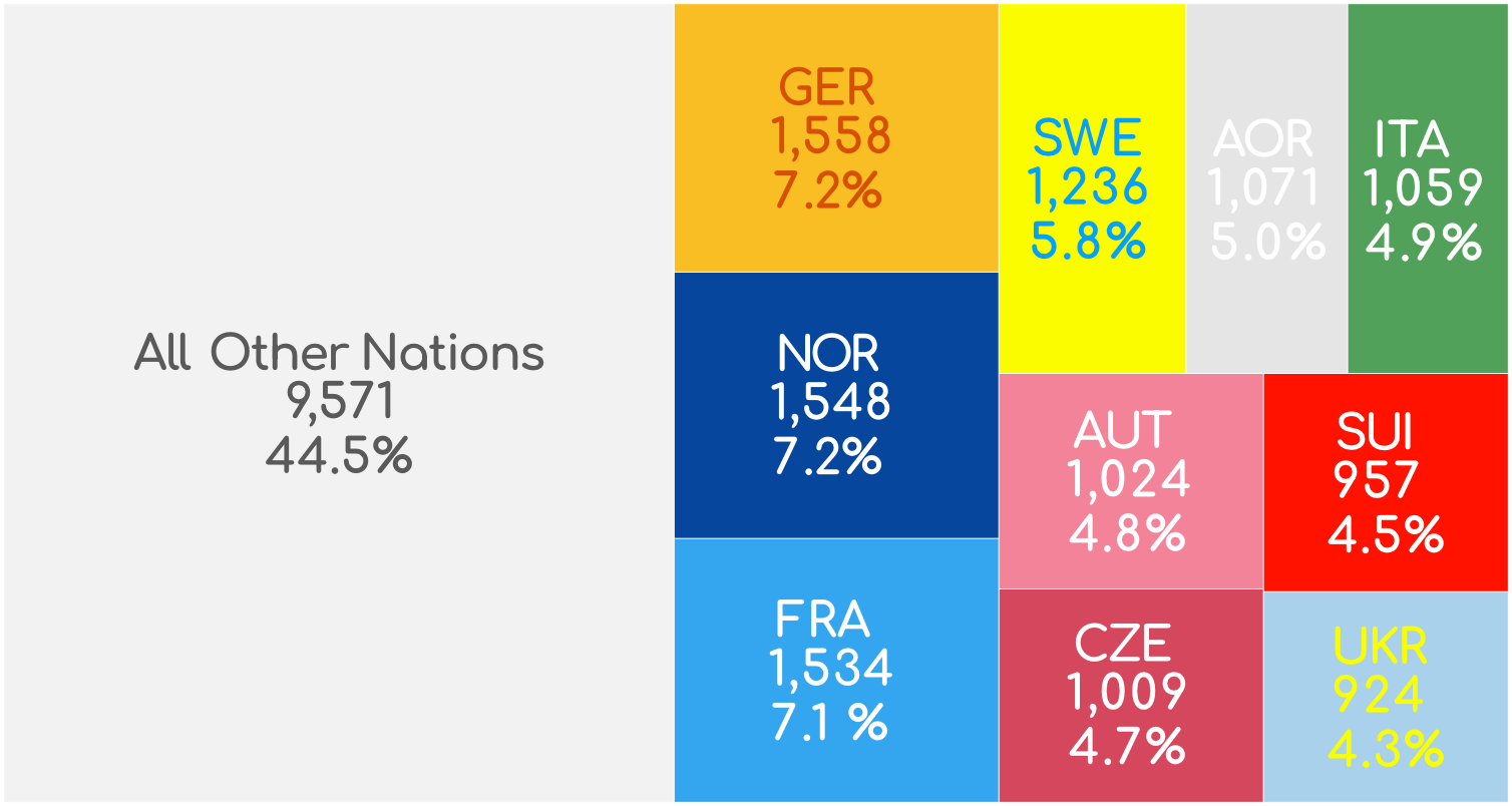
* AOR = Athletes Of Russia
Now let’s look at how many participants represent their nation per the following rank groups:
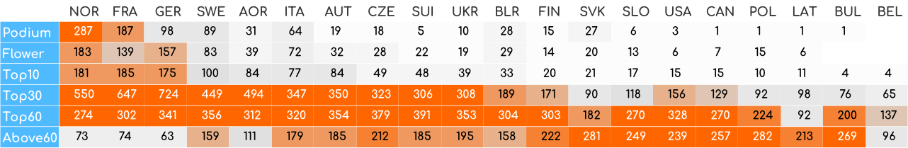
Despite some of the group names, the participants are not counted “cumulatively”. Although an athlete finishing in the top 10 is also in the top 30 and top 60, but this athlete would only be counted in the top 10 and not in the ranks above.
The following chart shows the number of participants in each group of rankings and are shown per nation they represent at the race (only shows first 20 nations:
The next chart shows the number of participants per rank group as above, but as a percentage of all participants for each nation, per rank-group. So for example we can ask “how many of all Swedish participants (1,236) were on the podium (89)?” for which the answer would be 89/1,236 = 7.2%. The columns all add up to 100%:
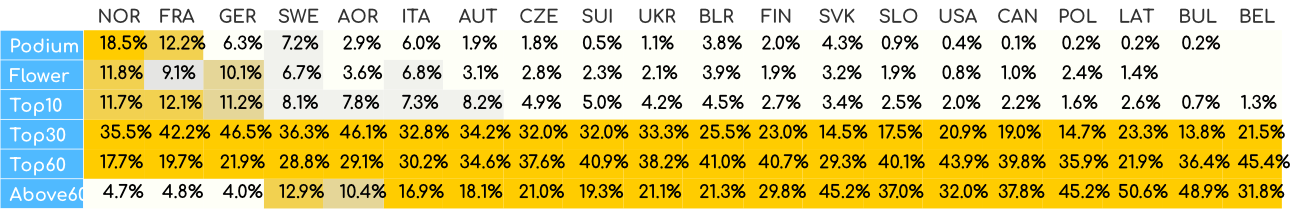
With regard to Norwegian dominance, this chart shows that 18.5% of all Norwegian participants was on the podium. That’s almost one out of every five! Of course this includes the JT Boe effect, which reduces the odds for all other Norwegians, but still.
Now lets look at the same numbers again, but in reverse compared to the previous chart: as a percentage of all participants for each rank-group, per nation. It shows which nation has the largest proportion of participants per rank-group, compared to all participants in that rank group. In this case the rows all add up to 100%:
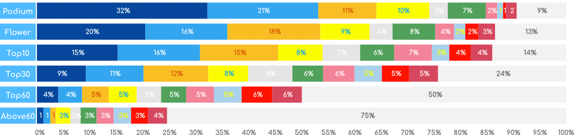
From this chart we learn that 32% of all participants that made the podium are Norwegian, and 21% are French. Those two nations dominate the podium places with taking more than half of all the spots available!
Of course it comes as no surprise that the Norwegians, French, Germans, Swedes and Italians are the strong nations in biathlon, and it should be noted that Athletes Of Russia have been absent for a part of this time period for well-known reasons. But it does also highlight how dominant Norway, and to a smaller extent France, have been for podium places, and how those two nations with Germany and Sweden “owned” more than half of the podiums, flower ceremonies and top 10s.
Finally, I wanted to see if the high number of Norwegian podiums is strongly related to the total number of participants (although with Germany having more participants its no guarantee). To check, I looked at two percentages:
A) the total number of participants of one nation compared to the total number of participants including all nations
B) the number of participants of one nation in a rank group compared to all athletes in that specific rank group
I found that 7.2% of all participants is Norwegian, yet of all athletes on the podium, Norway is represented by 32.2% of the athletes. That’s a ratio of 4.5! And at the other end of the rankings, these same 7.2% of all participants represents only 1.3% of participants in the Above 60 rank group, a 0.2 ratio. Have a look at the following overview to see the first 20 nations’ ratios per rank group, where ratios above 1 mean the nation has relatively more participants in a rank group than you would expect from the relative number of athletes as part of the whole dataset. Or, yellow is over-representation, grey is under-representation.
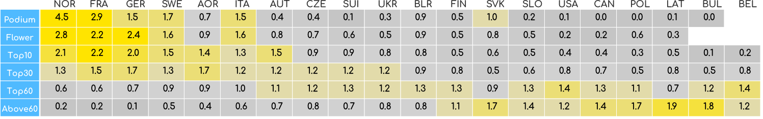
Now I rotate the rank groups to the bottom of the charts on the horizontal axis, and put the ratios for each nation per rank group on the vertical axis. Connecting the ratios for each rank group per nation shows what nations have a high ratio on the left side (top ranks) and a low ratio on the right side, the ideal distribution:
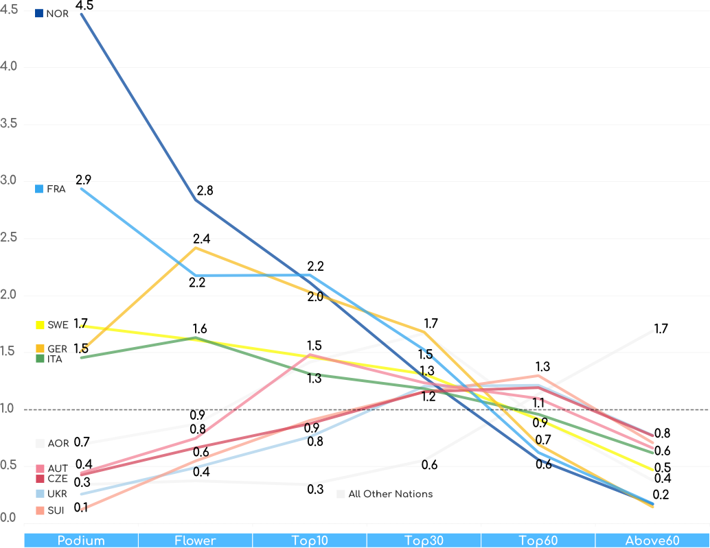
Norway’s line is just incredible, going from top-left (and well above other nations) to bottom-right quite steeply, and it answers the Trigger question affirmatively: the Norwegians are an incredible force on the IBU World Cup, and the data show us that exactly! This is nothing new of course, but the gap with the other nations, even the top ones, is astounding. France, Sweden, Germany and Italy also have a top-left to bottom-right trend, after which the lines are more flat or titled in the other direction.
It surprised my a bit to see this general domination of top 10 results by just five nations. Perhaps in the future I can look a these numbers per season and see what direction this trend is going in.
Did you like this article and want to submit your own Trigger request? Check out the Trigger submission page and pick the free monthly trigger option.