
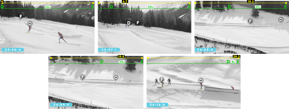
Think of the men’s mass start in Antholz. Vetle Christiansen leaves the range after the final shooting with a large-enough lead to be confident he’s going to win. QFM is in second place, and he also should be confident about getting the silver. But Dale and Soerum put in a monster ski performance (or did they?) QFM’s on the other hand struggles with the wax and perhaps also his fitness. The ease with which the two Norwegians close in on the Frenchman, particularly on the downhill sections, is shockingly noticeable. In the snapshots below, Dale makes up an estimated 57m in 26 seconds on Fillon-M. while most of the track is level or downhill.
For the full recap of this final section, I encourage you to read my previous post or download the pdf “GettingTheWaxRight_April2024“. But it got me thinking about a way to analyze the impact of ski wax on the ski performance of athletes. And also to see if there is a clear relationship between outliers in athlete performances and the snow conditions or the ski brand the athletes used.
This analysis, when successful, can (visually) answer questions like:
- Were there races in which athletes of the same nation had personal performance outliers?
- What were the conditions in those races?
- How about athletes of the same nation who had race performance outliers?
- And the same questions from above but adding the athletes’ ski brand to the mix?
- Did one ski brand do well or bad in certain race conditions?
Let’s get started!
Data
- I started with all non-team races of the 2023-2024 World Cup season, plus the World Championships in Nove Mesto, resulting in 25 races for both men and women
- Participants with the following results were excluded from those races: DNS, DNF, DSQ and LAP (did not start/finish, disqualified or lapped)
- Personal outliers, explained in detail later on, are based on athletes’ season averages. If athletes did not have enough data points I had to exclude them. I drew the arbitrary line at a minimum of ⅓ of the races (8)
- In the parts where I compare teams or other groups, teams with only one athlete in a single race are not included
- This gave me 191 athletes, 50 races, and 3,024 participants
The participant is the main character in this analysis: any athlete that participates and finishes a race. It’s participants that will be counted. It’s what I compare to a season average. It’s what I compare to a race average. Someone who raced all 25 races was a participant 25 times. A race could have 87 participants. The combination of the race_id and ibu_id1 is the key in this whole analysis (IBU’s unique identifiers for races and athletes).
An outlier is a data point that differs significantly from other observations in a data (sub)set. They are the most extreme high or low observations (wikipedia).
Ski performance for each athlete
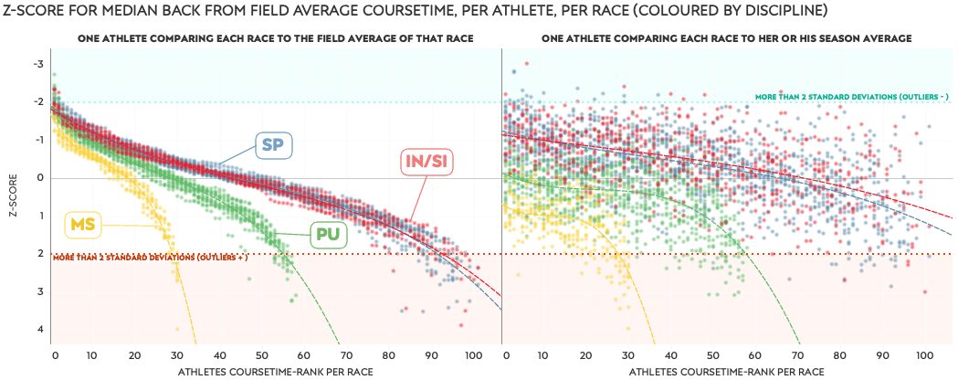
For participants’ ski performance I use % back from the median course time. It takes the median (which is typically very close to the average, or mean) of all course times in a race, and then relates each athlete’s course time to that average. This usually results in numbers somewhere between -3 and +3 although they can be further from 0. Negative values indicate the athlete is faster than the median course time of the field. Logically, a positive value then, means they are slower than the field average, which is 0. The chart below just gives you some examples and further explanation.
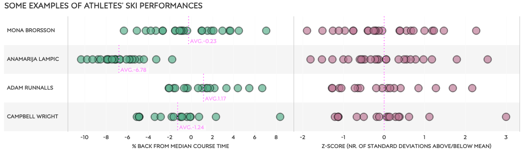
The above mentioned % back from the median course time is shown on the left for four athletes. Each green dot represent one race and the athlete’s % back from the race average. The season average (AVG.:xx) of these green dots for each athlete are shown with the pink line. Not surprisingly Anamarija Lampic has a season average of 6.8% faster than the average course time of the field. Adam Runnalls is an example of someone who, over the full season, is a bit slower than the field average, by 1.17%.
On the right side of the chart we see the athletes races again, but this time by the Z-score, also called the standard score. It’s a term coming from the world of statistics, and simply put it compares each single race performance of an athlete to that athlete’s season average performance. This comparison is then expressed as the number of standard deviations (SD) from the season average in a way that allows us compare athletes with very different (variations in) course times. As I’ll explain later, it is also a great measurement to use for identifying outliers. For now, just know that I assume anything outside of two standard deviations (2SD) is an outlier. So that’s any Z-score below -2 and above +2.
Have a look again at the top row of that second part of the chart above. It shows all races from Mona Brorsson. I’m going to show the same data but turn it by 90°.
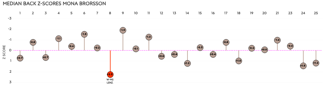
From left to right are the 25 races of the season in chronological order, and the Z-score is now on the vertical axis. The horizontal 0-line (—) is her season average. Only one race was a “slower” outlier for her season, with +2.3SD. It was the mass start in Lenzerheide.
Ski performance for each race
I just compared each race of an athlete to their season average, and plotted those races with a Z-score. The same can be done for each race. I compare an athlete’s course time to the whole field’s average course time for the race. This can then be expressed as a Z-score for the race. The next chart will make this easier to understand.
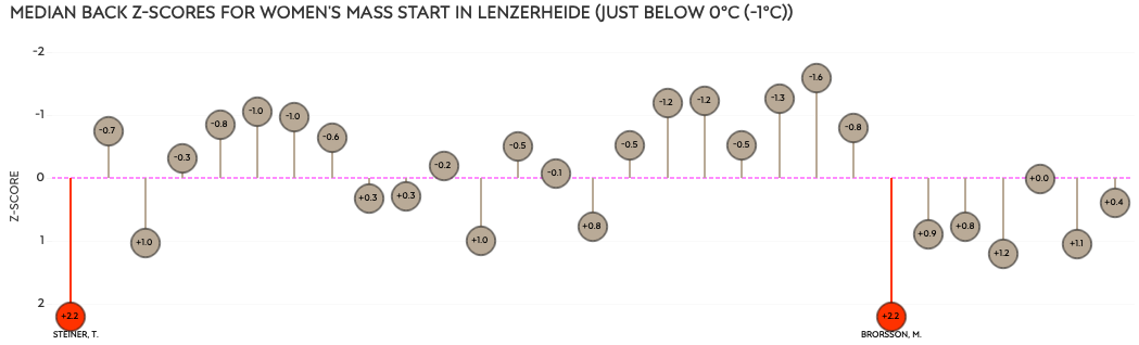
The chart is for the women’s mass start in Lenzerheide. We just learned that on a personal level, this was a bad performance for Mona, compared to her season average.
But here we see that compared to the other athletes in the race, she also had a bad performance. Note that her Z-score for this race is +2.2, not her personal +2.3. It means that her course time compared to the field’s average course time in this race was 2.2SD slower. We see that Tamara Steiner also had +2.2SD. And because I know you are wondering: Tamara’s % back from median course time for this race was +7.05%. Mona’s was +7.06%.
It’s important to remember this fact that an athlete has a personal Z-score and a race Z-score. They can both be outliers in a single race for a single athlete (participant) , like above for Mona, but it often happens that a race is a personal outlier, but not a race outlier, or the other way around.
One other thing to note is that the race performance compared to the athlete performance are correlated with the general asking skill and speed of an athlete. That correlation is much stronger for the race performance than the athlete performance, mostly based on the number of data points in the comparison. A quick look at the following charts shows what I mean.
Outliers defined
As mentioned, in this analysis I defined outliers as Z-scores more than 2 standard deviations from the average, in either direction (- or +). To remind you, an outlier is a data point that differs significantly from other observations; extreme values that stand out greatly from the overall pattern of values in a dataset or graph.
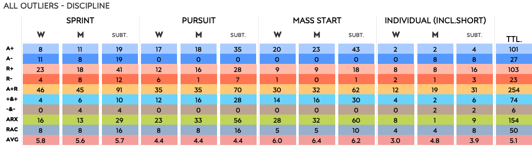
Now that I can determine participant outliers for personal performance and race performance, I can create a table with all outliers in the season. I can then split them in different categories or summarize them. Here’s an example of basic outlier counts per athlete.
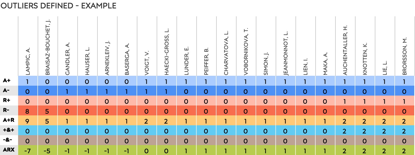
Let me quickly list the abbreviations for the counts of each type of outlier:
- A+ personal, slower
- A- personal, faster
- R+ race, slower
- R- race, faster
- A+R absolute values of A+, A-, R+ and R- added up
- +&+ in cases where an athlete has a personal and race outlier, slower
- -&- same idea, faster
- note: these last two are not the same as adding up the A+ and R+ but rather occurrences where they both apply for a participant
- note 2: I originally used athlete in stead of personal, so that’s why it’s A, not P.
The last one, ARX, is more like a score, rather than an addition of counts. We still add up A+, A-, R+ and R-, but here we count A- and R- as negative values. The first athlete, Anamarija Lampic, has one A+ and eight R-. Her A+R is simply 1+8=9, and her ARX is 1+-8=-7. No rocket science here. The ARX is an indication of how many of an athlete’s outliers are faster and slower, but heavily depend on the number of participations and outliers. When I’m going to work with groups of athletes, the ARX is not be the best way to compare. For example, adding and subtracting 70 outliers for athletes skiing Fischer to 12 athletes on Atomic, would give us skewed numbers. In those cases I will work with the average number of outliers per athlete in a group, a ratio of faster and slower outliers, or the average Z-score of the group.
Now that the concept of outliers is clear, we can link them to variables to hopefully be able to get to some answers.
Variables
There are many variables in biathlon that determine the outcome of a race. So many that we are basically always comparing apples to oranges, pears, kiwis, lemons and bananas. Even just for skiing performance there are many more than you would ever find in IBU’s datasets. So I have to simplify. In this analysis I look at the following variables in relation to ski performance: weather, nation/team, discipline and ski brands.
Snow temperature
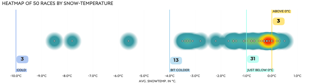
After looking at relationships between the different types of weather conditions2 available of any given race and the race performances, there wasn’t much to go with to be honest. Unless I looked at each team (separating women and men of a nation) or ski-brand individually, I could find no relationship whatsoever. Given that the measurements are a bit of a crapshoot to begin with, I ended up creating four simple categories for average snow temperature per race: above 0°C, just below 0° (0° to -1°), bit cold (-1° to -4°) and cold (-4° to -10°). The majority of races were around 0°C, give or take a degree or two.
Ski brands
Skiing fast is mostly determined by the athlete’s technical and physical ability, but the waxing of the skis plays a big role too. Every nation has its own team of wax specialists, who work with the athletes to give them the fastest skis for the race, based on the (predicted) conditions and athlete’s preferences, build, and style. That does not mean that when a team gets the wax right for some athletes on the team, it will apply to all members of the team. Again this can be based on many different things for each athlete, but the brand of skis they use plays a big role too. Every ski manufacturer has its own “secrets”, materials and processes for making the skis. And every brand has its own pros and cons in different conditions. Have a look at the pursuit races in Annecy in December 2022 for probably the clearest display of skis not working (Fischer skis in this case).
Based on the information available from the IBU, the participants in this data set use the following ski brands.

Nations
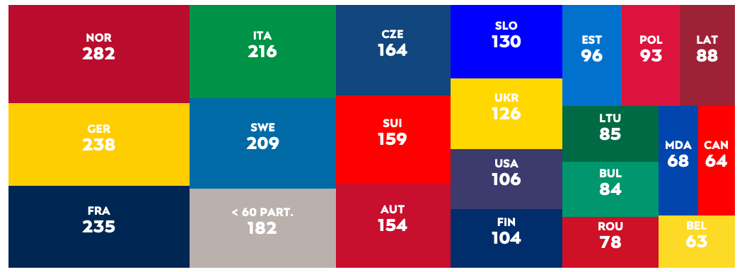
Participants represent their nations on either the women’s or men’s team. To my knowledge, participants of one nation are serviced by the same group of wax technicians. Someone like J. T. Boe may have a personal wax technician, or a technician may be specialized in a specific ski brand, but I assume they still work together for all the athletes of a nation. With staff moving between national teams or other connections, I suppose there will be some knowledge sharing. And we have seen at least once that the Belgian athletes were serviced by the French waxing team, I believe at the World Championships. Here are the number of participants (race-id + ibu-id) per nation. The nations with fewer than 60 participants in the season have been grouped together.
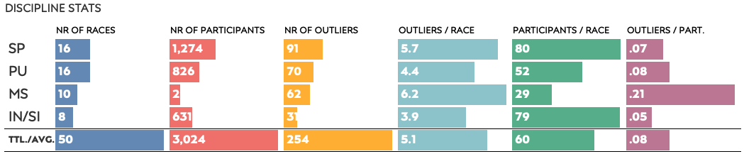
Disciplines
The length of the race, the duration and the number of participants will have an impact on the number of outliers. As mentioned before, I will look at using the average number of outliers per race participant when working with groups.
Outliers – counted
I’m going to start by looking at the number of outliers in the season per athlete. These counts include personal (A) and race outliers (R), and the athlete’s ARX over the whole season. I’m starting with the women and men, then the races, followed by different variables.
Athletes
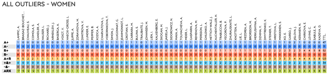
For the women there were 58 (A+ + A-) personal outliers and 65 ( R+ + R-) race outliers. In 34 occasions, an athlete had a personal outlier that was also an outlier for the race (both slower than average). There were no participants who had outliers faster than their season average and the race average).
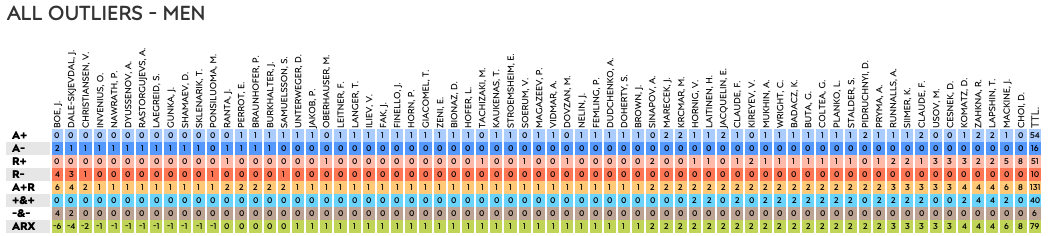
The men had 70 personal and 61 race outliers, of which 46 overlapped (40 slower, 6 faster). In case you don’t recall, the data set contains just over 3,000 participants; 2.4% of those had an overlapping outlier (personal and race).
Races
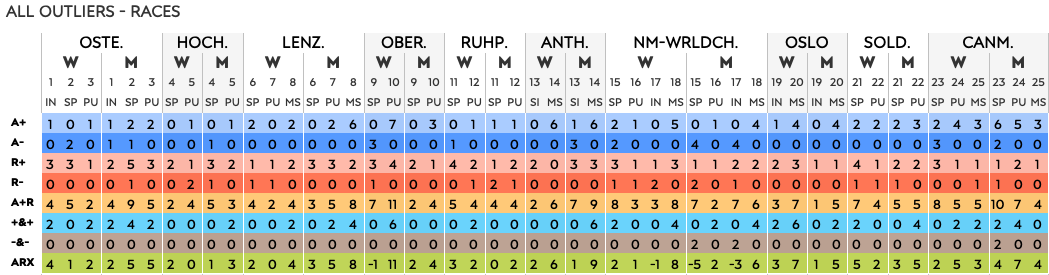
The number of outliers per race (A+R) varies from 1 – 11. If all outliers for a race are slower than the athlete or race average, it could indicate some teams missed the wax for the race. But it could also have been a tough races overall. The relationship charts a little further down will provide more insight.
Snow temperature categories
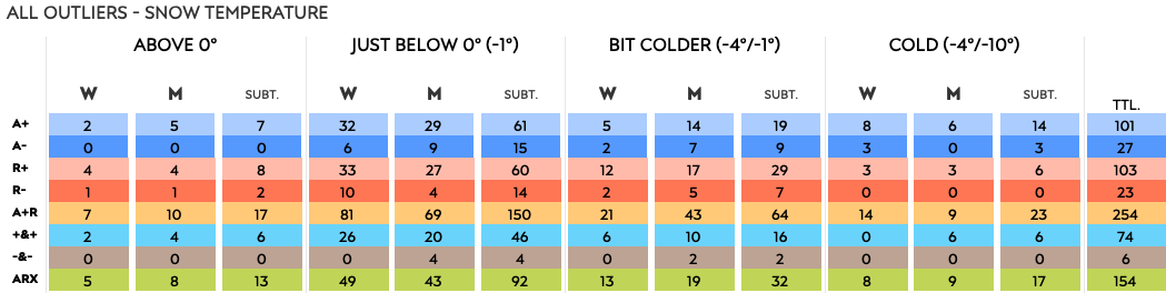
As over 60% of the races were in the “just below” category, it is not surprising we see the most outliers there. This is where the grouping issue shows up, so we need to look at it differently.

Looking at the average number of outliers per race for each category, the coldest races have the most (7.7) outliers per race on average, but that average is based on just three races.
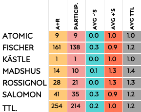
Ski brands
The majority of athletes ski on Fischer, with over 50% of them represented by the German ski brand. Now let’s have a look how the different ski brands do with outliers. Please note that the smaller the number of athletes skiing on a specific brand, the higher their personal impact is on the averages.
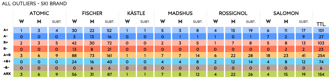
You can see this effect on the women’s side where the ARX of ski brand Kästle is based on Lucie Charvatova alone. Lucie had just one personal outlier where she was more than two standard deviations slower than her season average, giving her an ARX of 1.
Look at the average number of outliers for each brand, the difference are not that big.
Nations
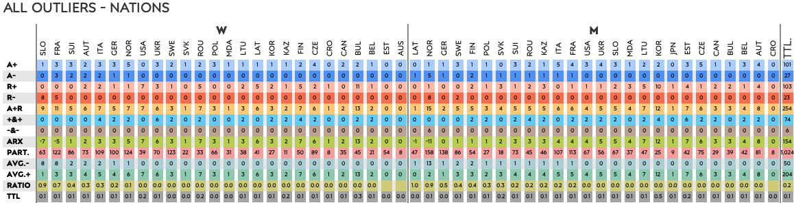
Here too, we see that one athlete has a big impact on a nation’s total number of outliers. Lampic, the only Slovenian woman with outliers (the other three had none), has 9 and an ARX of -7. She happens to be one of the fastest skiers in the field. And, as one of the fastest men’s teams in the world, seeing the Norwegians at -11 is no shock. Although perhaps it it is a shock the number is not even lower, knowing how many fast athletes they have waiting to join the World Cup team.
Disciplines
From this table we can cautiously conclude that there are typically more outliers in shorter races. Or in races with fewer participants. I could make a case that in those races the field has more time to “even out”, or that the average is more “solid”. That said, another case could be made that as the best athletes have more time to separate from the still-developing athletes, the larger gaps may increase outliers. Which would also mean the variability (standard deviation) would be larger, which then again could lead to fewer athletes going beyond the 2 standard deviation boundaries. Will looking at multiple variables give us more clarity?
Relationships
Finally it’s time to bring it all together. In this section I will look at multiple variables at once, and look for ways to answer our main questions about outliers happening in national team groups due to certain variables.
ARX and the number of outliers
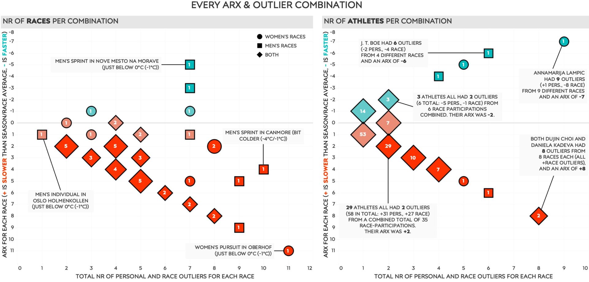
Here is an example of two scatter plots that show a relationship between one measure on the vertical axis, in this case the ARX per race, and another on the horizontal axis, here the total number of outliers per race. It then shows how many times (races on left side and athletes right side) they happened for each combination of these two measures. This works when counting participants, athletes or races. But when we want to look at groups we need to use some aggregation. Note that even then, the number of participants in a group still has a strong influence on the results.
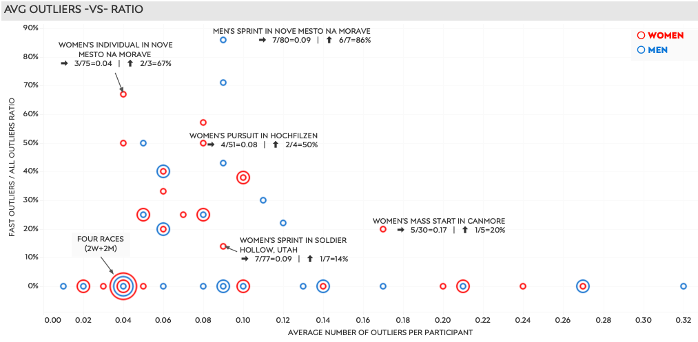
This chart shows each race of the season, 50 in total, using aggregations. The value on the horizontal axis is set by dividing the total number of outliers in the race by the total number of participants in that same race. The vertical axis divides the total number of faster outliers (- values) by all outliers (+ and -) for each race.
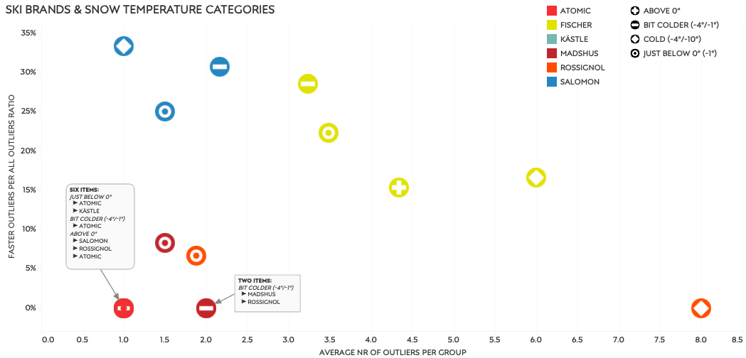
Ski brands & Snow temperature categories
Because we are now comparing groups of different sizes I’m using the average number of outliers per group, and a ratio of faster and slower outliers here as well. It will give me a normalized number of outliers per participant, and an idea of how many were faster and slower than average. And it’s plotted by ski brand combined with snow temperature.
Nations’ athletes combined for women and men
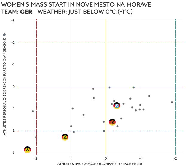
In the concluding charts I grouped athletes by their nations. Then, per race, I use personal performances, personal outliers, and race outliers, to select races where certain nations as a whole did well, or not so well. I started with an automated selection, highlighted in yellow. From that I hand-picked a couple of slower and faster team performances, four per gender, to further explore. They are identified by the numbered circles.
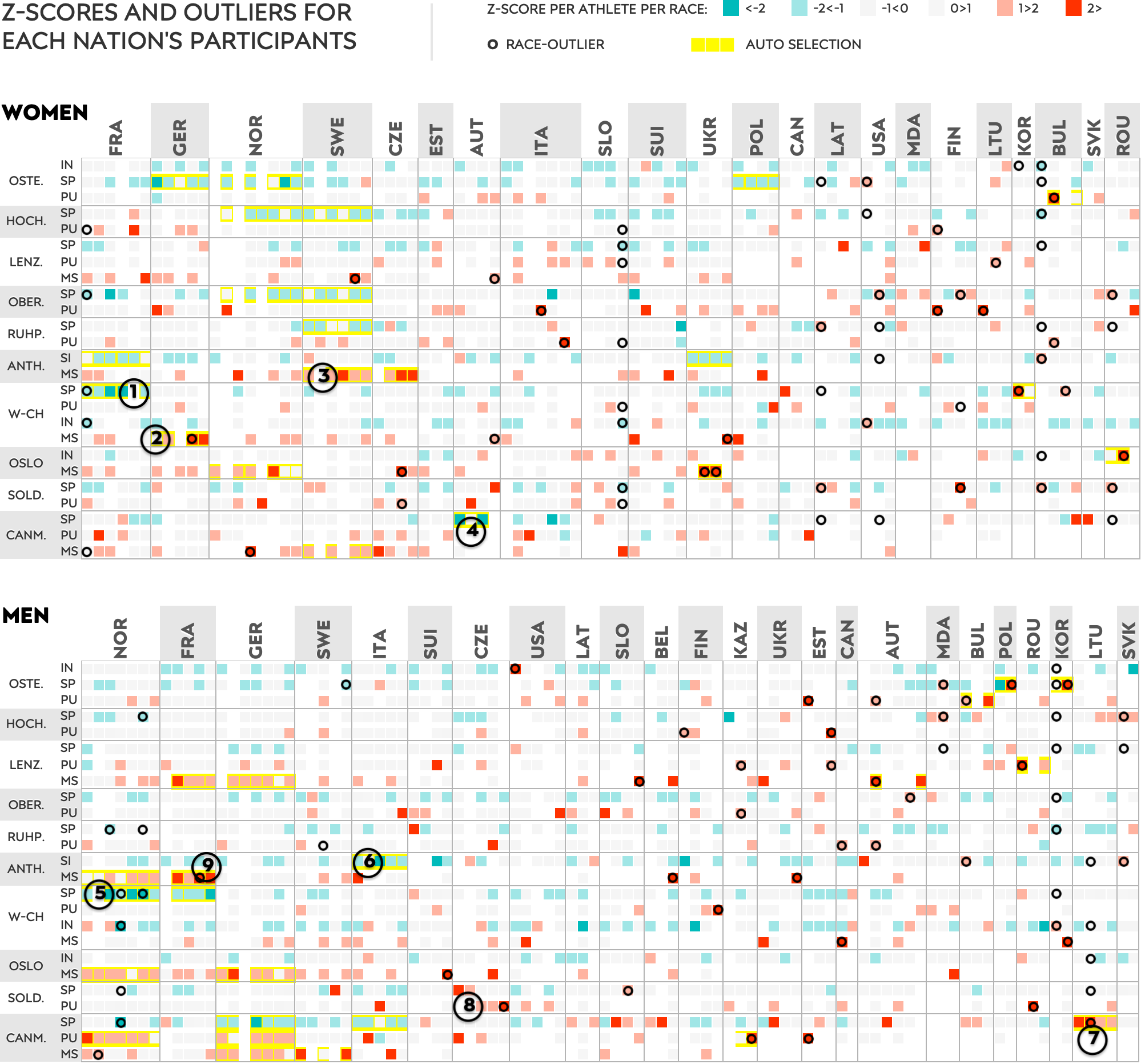
- French women – sprint at World Championships
- German women – mass start at World Championships
- Swedish women – mass start in Antholz
- Austrian women – sprint in Canmore
- Norwegian men – sprint at World Championships
- Italian men – short individual in Antholz
- Lithuanian men – sprint in Canmore
- Czech men – pursuit in Soldier Hollow
The following charts show the eight races individually. Each dot represents a participant, and the athletes of the featured team are shown by their nation’s flag. On top of that, if you look closely, you will see the ski brand they use. Their position in the chart is based on their personal Z-score on the vertical axis, and their race Z-score on the horizontal axis. Every two examples will be followed by a brief explanation.
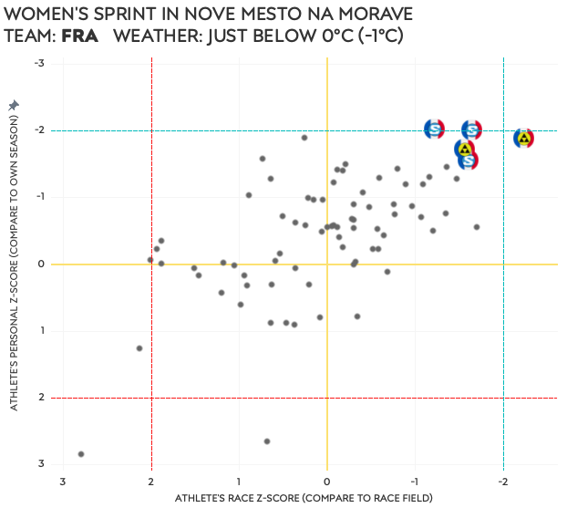
I guess the French women ① had a really good day in Nove Mesto, for athletes and wax techs alike. If wax was an issue for the Germans ②, I would say it mostly affected the Fischer skis. None of the four German athletes had a strong skiing performance, but neither did the whole field as all were below their season average.
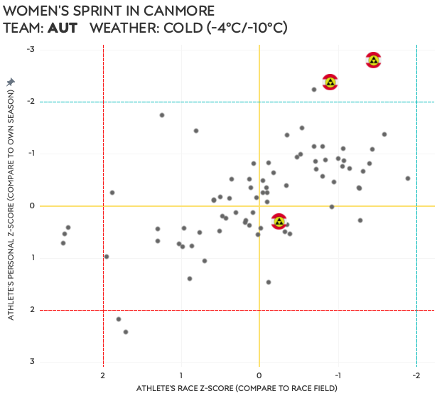
Either a stomach bug had joined the Swedish team ③, or they didn’t hit the wax that day. All had well below average personal Z-scores, and although their race Z-scores were better they were still not very good. The Austrians ④ had two amazing ski performances and I would guess they hit the wax just right. Although the slowest of the three did not have a good race compared to her season average, she still outperformed the field’s average for this race.
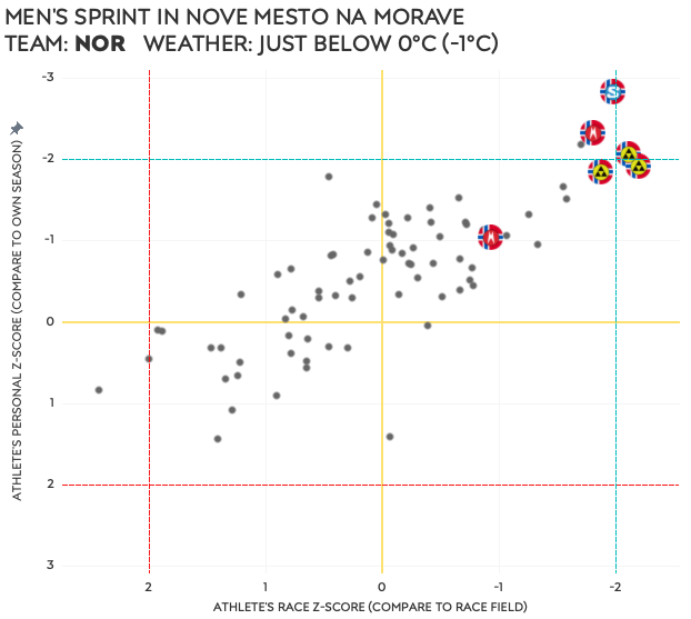
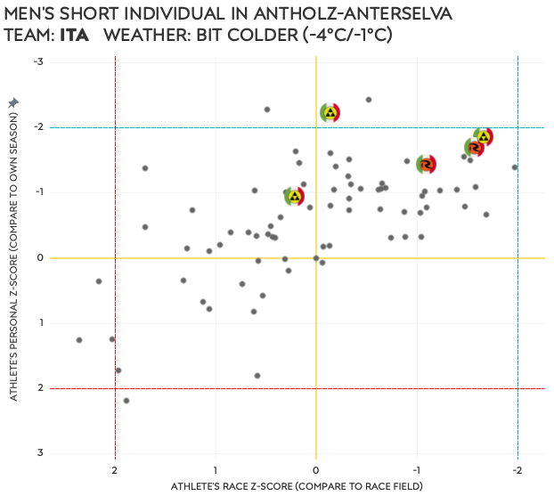
Of course, being all Norwegians ⑤, this could just be a simple example of their incredible dominance in the skiing department. But given all six athletes outperform the field (not shocking) and their own season average, the wax team must have done something right. Same can be said for the Italian wax techs ⑥, if all five athletes have better-than-season-average performances, and four out of five do better than the race’s field average.
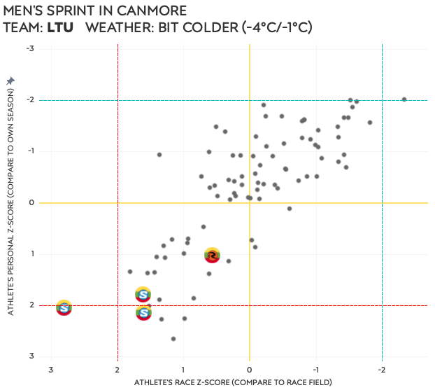
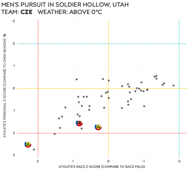
Although it appears this race was good for fast skiing, the Lithuanians ⑦ missed the wax in Canmore, perhaps specifically for Salomon skis. The Czech men ⑧ had a similar experience in Soldier Hollow. Given that both groups did not do well on a personal level either, it could be related to jet-lag and end of season exhaustion as well.
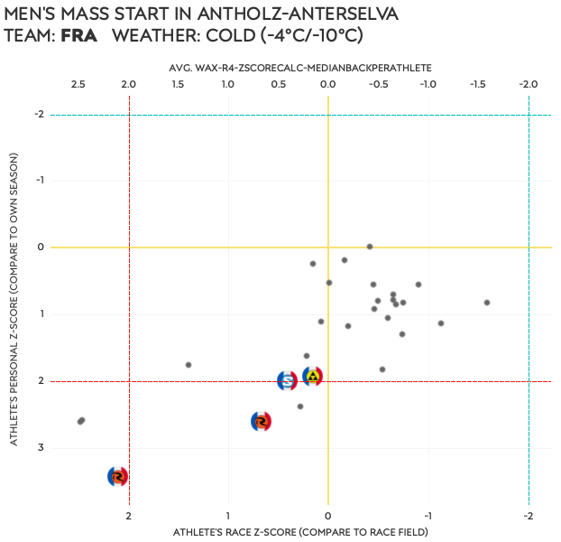
Now, before we come to the end of this article, let me go back to the men’s mass start in Antholz one more time to see what was happening with the French team and Quentin in particular.
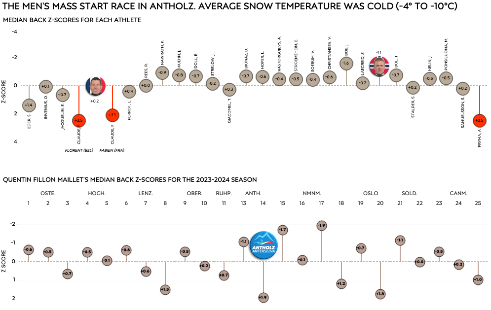
Apparently it was a tough race to begin with, with only one athlete performing at his season average level. But not only were all French men well below their season average, they were also on the slow side for the race. Clearly they weren’t having a good day, and it’s hard to imagine this was not at least somewhat related to the wax. Interestingly enough, Quentin was the best of them!
The last two charts show the same data horizontally. The first by showing the horizontal axis from the chart above flipped by 90°, comparing the athletes’ Z-scores to the race average. The second shows Fillon Maillet’s races throughout the season, with this specific race in Antholz being his worst when it comes to his ski performance.
So. Can we now answer the questions from when I started this article? If you made it all the way down here you deserve to know!
- Were there races in which athletes of the same nation had personal performance outliers? I hope you agree I answered that in the last section, and that there are enough examples to answer yes.
- What were the conditions in those races? They varied, and I would conclude that the snow temperatures didn’t have much impact. I didn’t see evidence of one team always doing bad in certain snow temperature conditions.
- How about athletes of the same nation who had race performance outliers? As explained, this is not as common as seeing all personal outliers on a team.
- And the same questions from above but adding the athletes’ ski brand to the mix? and 5. Did one ski brand do well or bad in certain race conditions?Although we can see some brands stand out more than others, there really isn’t enough data at a team/nation level to draw conclusions. Even the relationship chart for ski brand and snow temperature should be read with caution, as some combinations happened only a few times.
Conclusions
Writing this article and analyzing the data from multiple angles (and restarting the analysis a number of times) gave me a lot more insight in the potential influence of wax on ski performances. Can I definitively say I can wax team performances from race data? Absolutely not. Do I have some better indicators to highlight races and team where this may be the case? I strongly feel I do.
I hope you enjoyed this article and learned a couple of things while reading it. If you made it all the way through, I thank you very much for your time. I must be honest and say it was not my intent to spend this much time and write this many words on it. But I’m happy I did. I hope you are too.