
Let’s just assume two athletes were really close in World Cup points with one more race to go. Wouldn’t it be nice to compare different statistics between the two of them? Radar charts are meant for just that particular situation! Every axis leg on a radar chart represents one statistic. And the position on that axis leg represents one of the athletes. You then connect the dots per athlete and boom! you have a Radar chart. Now if we add a line representing the Field Average and assume the inside that line is good, and outside of that line bad, and we can do some comparisons!
Going back to our example, why don’t compare JT Boe and SH Laegreid?
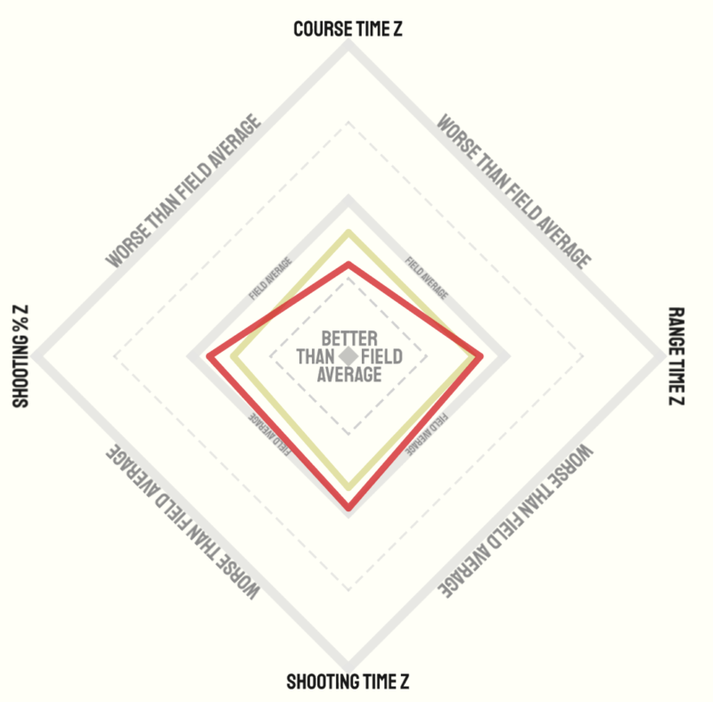
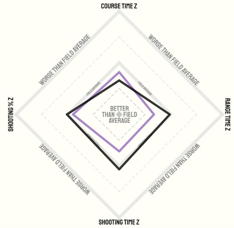
We can see here that SH Laegreid is faster than JT Boe for Z scores in shooting percentage, shooting time and range time, but that JT Boe is faster than SH Laegreid in the course time. On the women’s side, Eckhoff and Wierer show a very similar view:
The beauty of these Radar charts is we can do this for all sorts of analysis, like how the men and women from a Nation do when compared to the field average. Here is Norway as an example:
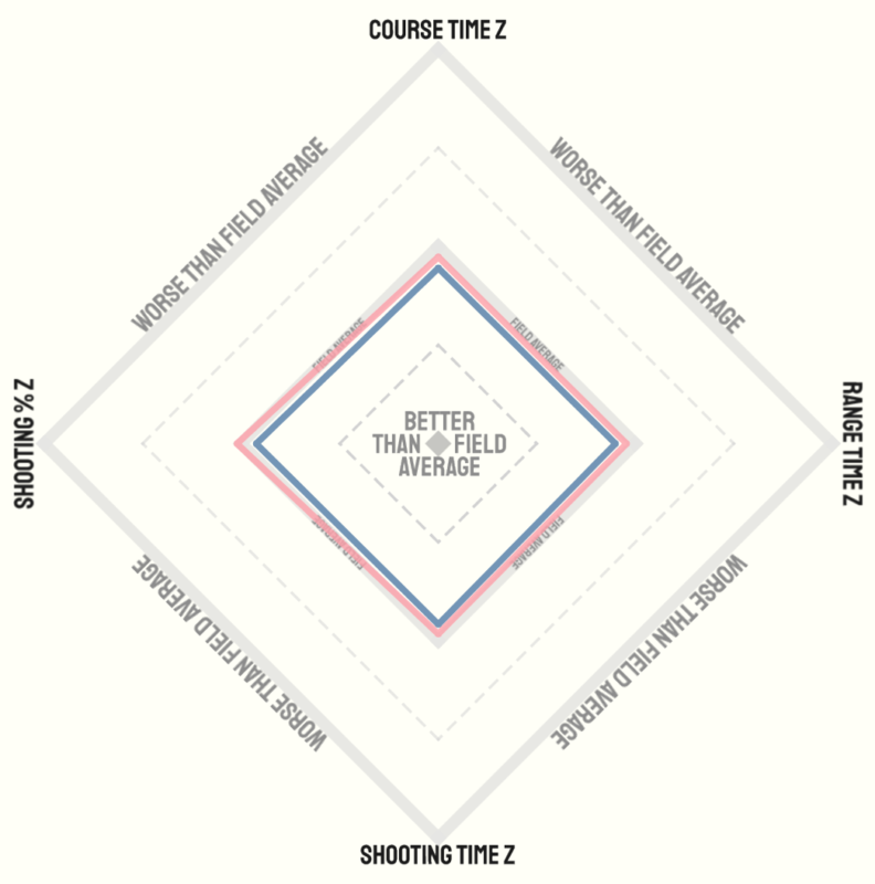
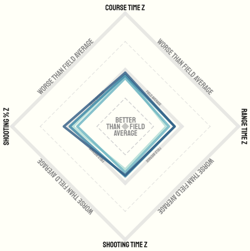
Mmm, I guess those Norwegians are pretty good! Another analysis we can do is comparing statistics per season. Lisa Vitozzi had a disappointing year, but where did things go wrong? The Radar chart below shows that although she was worse in every aspect shown in this chart, particularly her shooting percentage and range time were a lot worse than previous seasons:
I hope you have a better idea of what you can analyze with Radar charts, and that the power of them is to quickly see differences in statistics between multiple athletes, groups and seasons. Why don’t you go and try it out in the interactive dashboard where all the above charts were taken from? Can you find it on my profile on Tableau Public. I hope you have fun!
RJ