Two seasons ago, the Swedish broadcaster SVT followed the Swedish national biathlon team for a season. The shows were fun and interesting to watch, and a specific part of an episode got me thinking about ski times per loop and sector. A number of athletes are lying on a hotel bed, looking at a small laptop held by coach Johannes Lukas. He has a couple of charts with ski times in certain sectors and how his athletes compare to other competitors.
I know from numerous athletes that they check the race stats from biathlonresults.com but it’s usually pretty quick and high-level. Looking at the screen, Sebastian Samuelsson comments “it would be great to have this data right after the race and especially before the next race”. There is some joking about the charting quality, and from what I understand that it takes some time to put it together so that it’s easy to see.
If you know anything about me or my work, you’ll know my brain is on high alert by now. I won’t bore you with all the little tricks the IBU puts in their data to make this quite a complicated undertaking (some consistency in loop descriptions would help for example), but the result is on my Tableau Public page and I will describe it briefly below. Please have a look and let me know what you think, as a fan, an athlete, a coach or anything else.
Data & content
The data used in the dashboard contains the IBU data from the 2020-2021, 2021-2022, 2022-2023 and 2023-2024 seasons, all non-team events, and all results that were not LAP, DNS, DNF or DSQ. As the 2024-2025 season progress I will add concluded races to the data.
The dashboard has four pages, and all the data for one athlete, selected from a dropdown list, are visualized with four main focus points:
- Sector time in seconds; one (selected) race;
- Sector time in % of the field’s average sector time, one race;
- Season averages for one or more selected season(s);
- Location details for selected location.
ATH|RACE|Sec
Start by selecting an athlete from the dropdown, and one specific race you want to review:
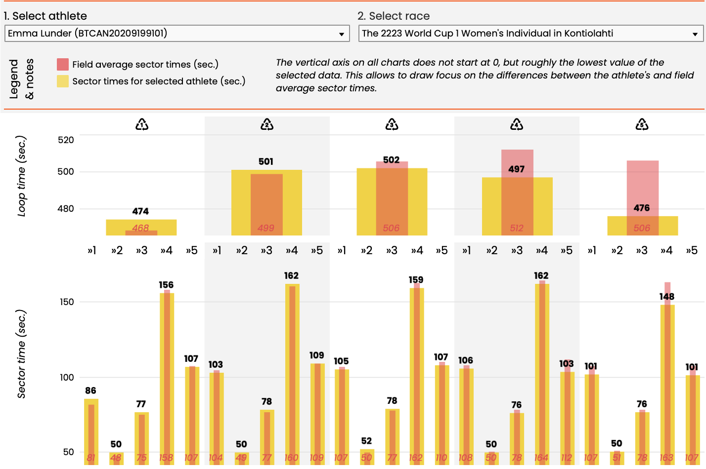
By selecting fellow Canadian Emma Lunder and the 2223 Individual race in Kontialahti I can see Emma’s loop and sector times from that race, compared to the average sector time of the field. The dashboard shows the same data in different types of visualizations to make it easier to possibly find some answers in the data.
ATH|RACE|Sec
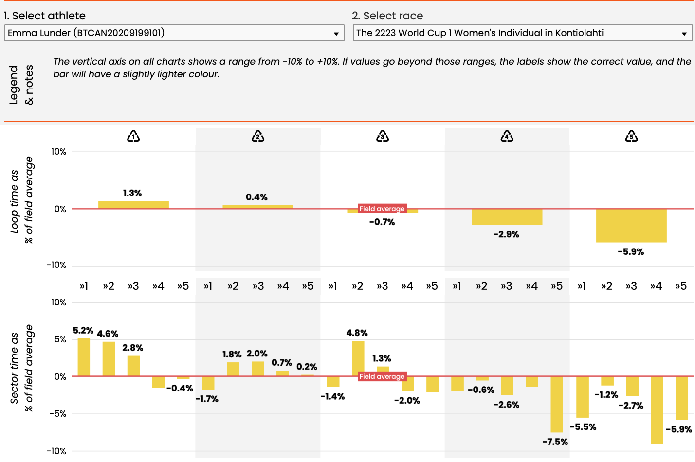
The second page is very similar to page 1, other than here I show sector times of the selected athlete as a % of the field average sector times. Note that negative percentages mean the athlete is faster than the field, and positive percentages mean slower than the field. By default the selected athlete and race from page 1 are also selected here.
ATH|RACE|Sec
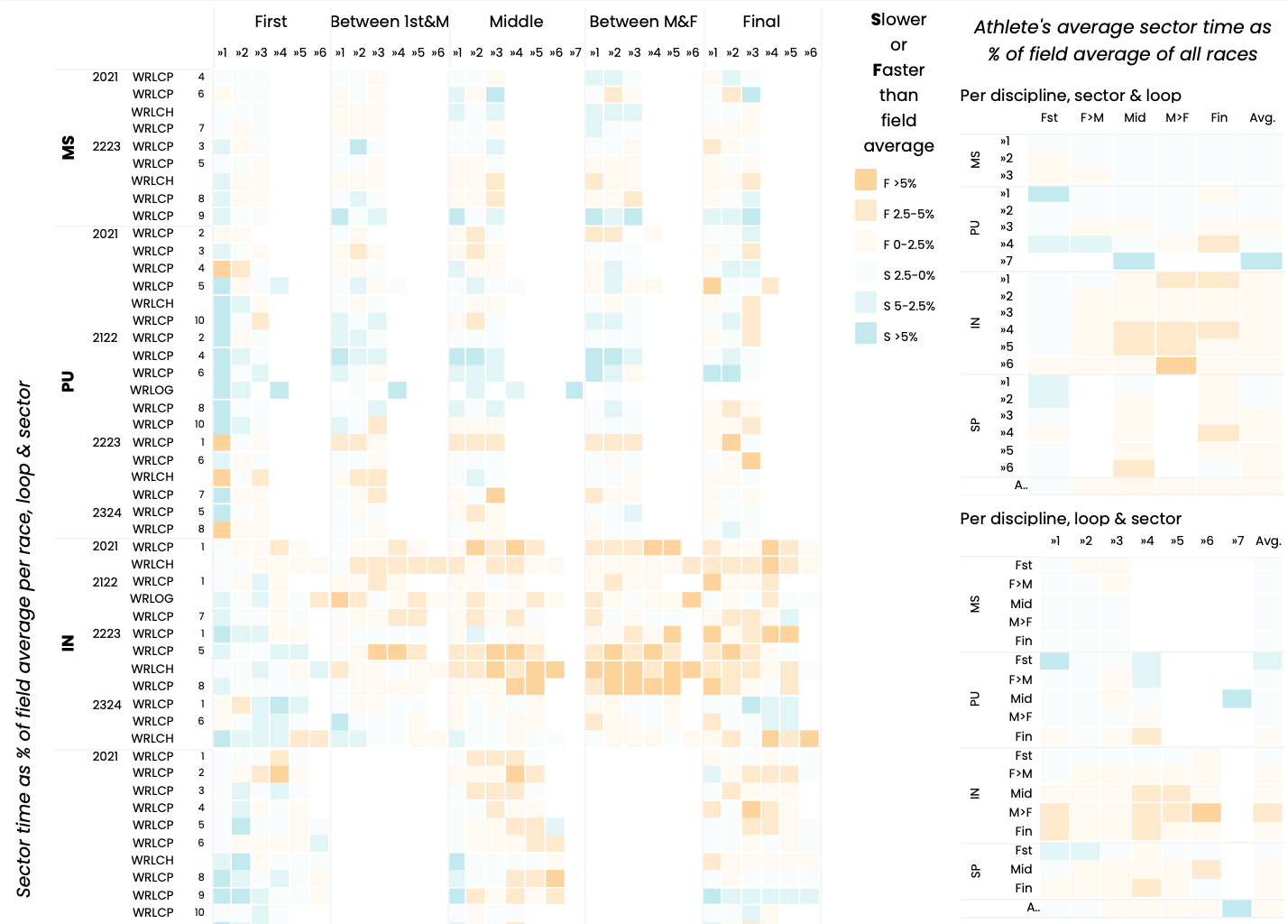
Where the first two pages are very specific, pages 3 and 4 are more to be used to get a general sense of how the athletes paces throughout the race. The third page keeps the same athlete selected (but can be changed), and shows the classified sector times for each season, discipline and race in one overview, as well as averages per discipline. More orange is faster than the field, more blue is slower.
Although disciplines are shown grouped together, Sprint races (3 loops) are not mixed with the other disciplines (5 loops). Rather than comparing loops 1, 2 and 3 from the Sprint race with the first three of the 5 loop races, I chose to reclassify the loops to First loop, Between first & middle loop, middle loop, between middle & final loop, and final loop. This way we can at least line up the “flow” of the race comparing the last section of Sprints with those of the other disciplines.
ATH|RACE|Sec
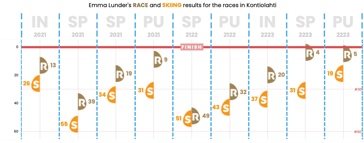
The fourth and final page allow the athlete to look back at races performed at a specific location in previous seasons. Although conditions, form and even loops can change, they still provide some general indication where an athlete was faster or slower than the field.
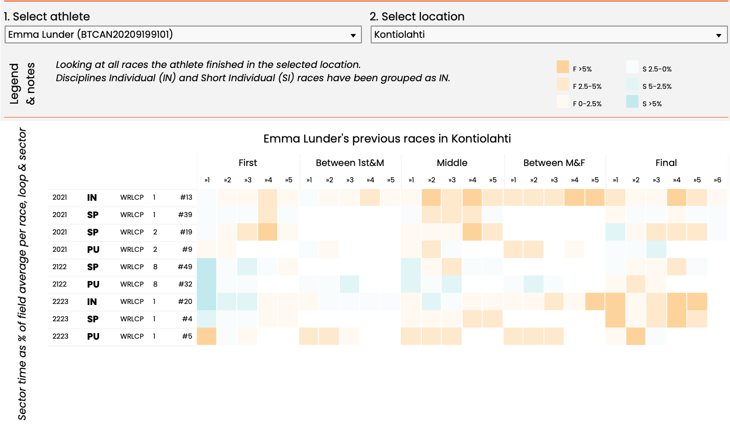
The bottom section of page 4 shows previous ranks, both for the race and the skiing performance at the selected location.
