
After seeing the races in Le Grand Bornand a few weeks ago, and especially some of the French athletes, I wondered how much impact a home crowd and venue has on an athletes performance.
As with most research projects for biathlon, it is impossible to isolate certain factors and exclude others. With that in mind, I realize that my research below has some influential factors that are not included; the sample size for home races is too small. Some of the more recent events had no spectators. The home events are not evenly spread over the time period of the used data. A home venue based on the nation is not necessarily the true home venue for all athletes. The conditions at certain venues may just be better or worse, generally, and suit some athletes more than others. Etc., etc. This all said, I still think the research below shows some interesting results. Just set aside your natural “well yeah, but…” reactions and continue reading.
Data
I took five seasons of data from RealBiathlon, starting with the 2017-2018 season, up until (and including) the fourth event in Le Grand Bornand this season (2021-2022). I removed all non-finishers from the data, and all team events. And for the final results, I focused on those athletes that are active in the current season. Then, as mentioned above, I assumed that when the nation of the athlete and the event are the same, it was a home event for those athletes.
In the given timeframe, we are talking about 222 races in total, with 581 athletes participating in one or more events. Of the 222 races, 206 had representation from the home nation, and generally, the home athletes represented about 4-5% of the total number of athletes per event.
The measure to show performance in this research is the overall ranking per athlete per race.
Nation averages
As athletes differ in how they deal with pressure and if they perceive a home crowd as an advantage or disadvantage, looking at the nation’s averages should be taken with a grain of salt. But it is still interesting to see how nations do on average for men and women. The chart below shows men in blue and women in pink, and the lines between dots, the average rankings, should be read from top to bottom. Going down and left means the nation performs better when in other countries, and going down and right means they do better at home.
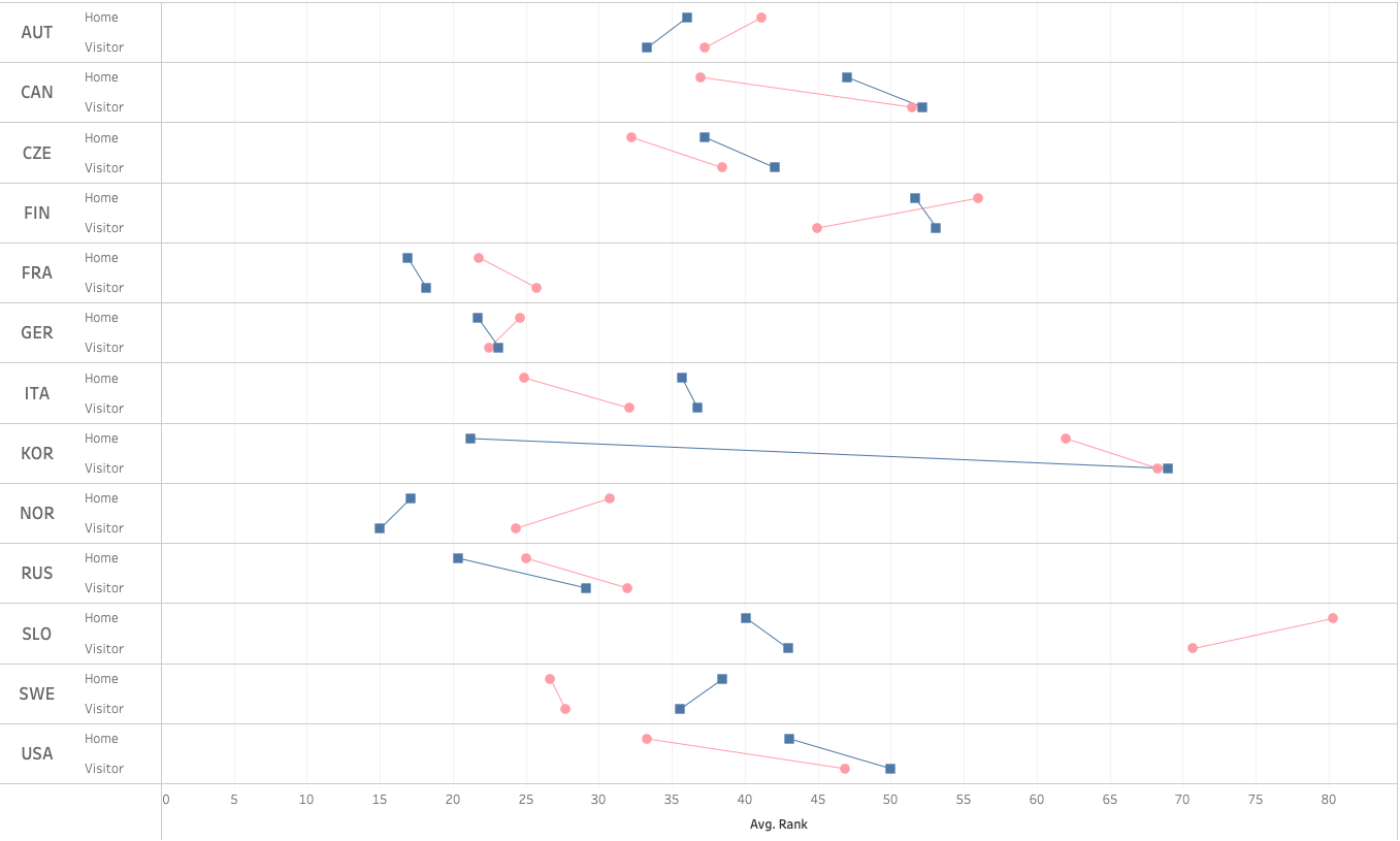
Interestingly some nations are very similar for men and women, whereas others are completely different. It also shows how some nations, like France, are similar in performance whether racing at home or in another country. Other nations significantly over-or underperform when at home.
However, as mentioned, looking at averages comes with many caveats. Take the French team for example. At the nation’s average level they look like this:

But when we look at the individual level, we can see that there are many differences between athletes:

Individuals
So, now that we are looking at the individual athletes, we can plot every athlete based on their average rank at home compared to their average rank when not at home. The darker the green, the better they do at home; the darker the red, the better they do when not at home. Circles are women, and squares are men.
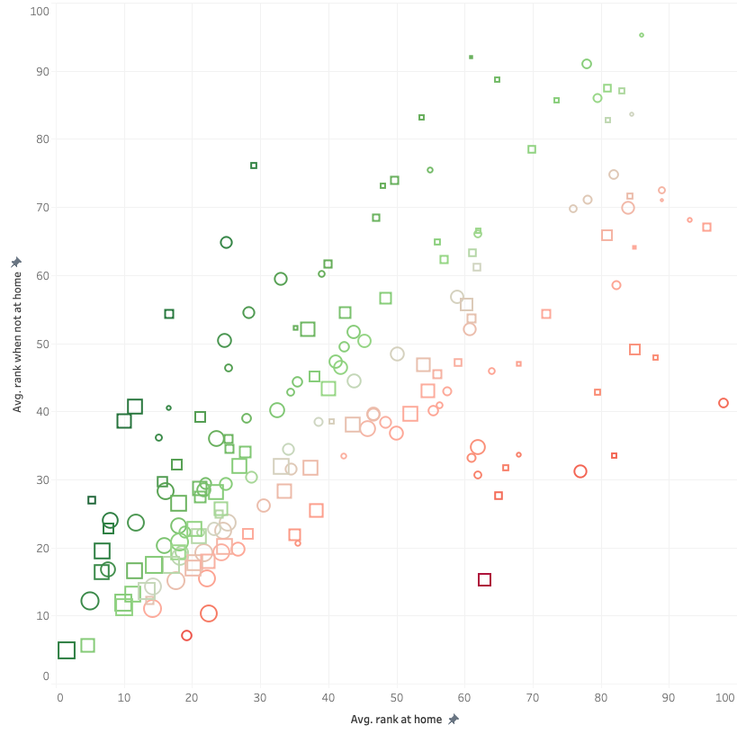
Roughly looking at this chart, we can say that there is no clear tendency toward benefitting from performing at home or away from home. But this includes all athletes that have at least one race at home and at least one away from home, which can give a skewed picture. For example, the dark red square at the bottom right is Johannes Dale from Norway, who had only one race in Norway. He finished 63rd, where his average of 55 races outside of Norway is 15.23. Not really fair to say he does not do well at home based on one race there.
So let’s apply some filtering, saying that the included athletes must have raced at least 25 races in the given timeframe. And of those, at least 5 must have been at home. We also want to exclude any ranking above 40. And lastly, we want to only show athletes that are active in the current season. This gives the following picture:
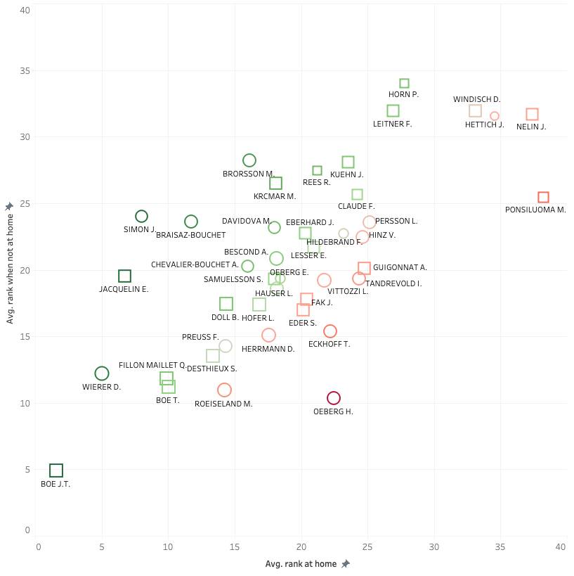
Based on this chart we could conclude that for example, Hanna Oeberg does typically not do well at home, whereas Julia Simon does do well at home. Let’s double-check that by looking at all their rankings of their races, in which the size of the bubbles indicates the number of races (larger is more races; blue are home races):

Although Hanna Oeberg has some strong results at home, her three worst results were at home too. Contrarily, Julia Simon had only six races at home, but they were all strong with 17th being her lowest rank at home.
Conclusion
So, still knowing that many factors not included in this research can play a role in these results, I think it is fair to say this gives at least some indication of who is strong at home and who is not, over the five-season period. And that leaves us with seeing which athletes do best at home versus who do worst at home. We can show this simply by dividing the home average rank by the not-home average rank minus one. Anything below zero is better at home, and anything above zero is better away from home. The line thickness indicates the number of races participated in.
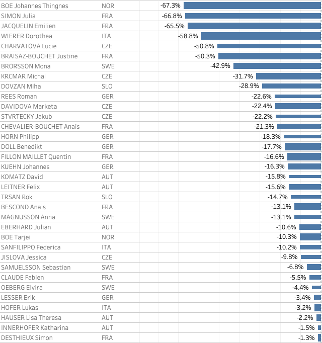
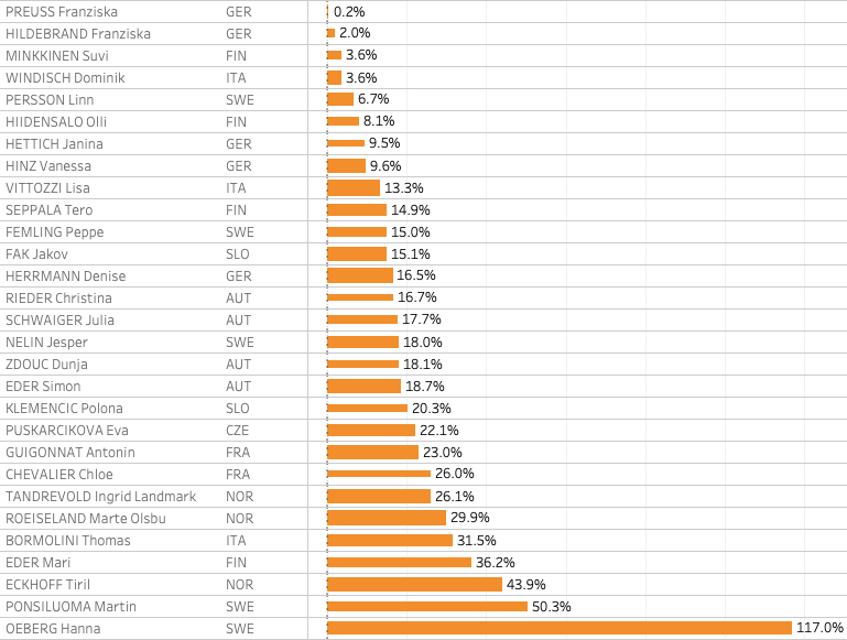
Some notable names are JT Boe, Emilien Jacquelin, Julia Simon and Doro Wierer in the positive sense. Hanna Oeberg, Tiril Eckhoff, Martin Ponsiloma and Thomas Bormolini stand out on the negative side of the scale.
What do you think? Based on this information, can we say that some athletes prefer home races over races in other venues? Let me know on Twitter!